

The rough pencils. Getting ready for inks. Still a lot of work needs to be done, but I'll take it as it goes. I will attempt to make it as precise as possible, but some of the background will have to be done in photoshop, in order to create the correct depth.

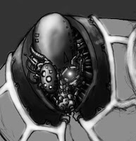
I decided to do a quick color test. It is also intended to give me a better idea of how the surroundings are going to work. In this case, I got a small bonus. See his right arm? It is not connected to his shoulder quite right. Luckily, I caught this early enough to fix it... I think. I also did a close-up of his face. I wanted to test the type of shading that would be needed, to pull of the very small details of his mask/helmet. I hope to add additional detail with the colors.

Started adding some inks. This is roughly the level of detail I'm going for. The details on the suit will have to be added in photoshop - there's no way I can draw such small details with my markers. I still hate his arms, but I'll attempt to fix them later.

I've started inking in the foreground. To me, the detail level of one thing, sort of dictates the detail level of the rest of the drawing. For instance: The Magma Scythe (right-hand weapon) ended up very detailed, and that meant that I had to keep up that level - otherwise it would look out of place. The rubble in the foreground is basically done on-the-run. I just looked around my room, and started adding random bits and pieces. I wanted to add a mug with the words "Worlds best Boss" on it, but the lettering would be too small to read. I have to sort all this stuff out in the coloring process, because right now it's just a mess (as it is intended to be). I cleaned out the background, to get a better look at the general composition.

Okay! That's the inks done - and what a nightmare is was! This is about 18 hours of work so far, from rough pencils to this. It does however give you a certain, not entirely un-Geoff Darrow-esque satisfaction. Now I would recommend anybody to take a break. Sleep on it. Let is seep in. Look it over in the morning. You'll practically be blind to your own mistakes by this point. If you really wanna torture yourself, try flipping the picture horizontally in Photoshop - that'll really bring out the errors.

Here we have the first light test. I needed a quick idea of how the light was gonna look. We also get the first real impression of depth. The lights in the power conduits are a bit exaggerated, but I really wanted to bring out the energy. Remember kids: Nothing short of detonating a nuclear device, is gonna outshine the sun - so keep that in mind, when you're doing pictures with natural daylight as a light source.

Getting real. Okay, so now we go for it. I've done all the testing I can possibly think of and I'm ready to get down to business. What you see here, is basically what I've already tested: lights and shadow and the beginning of colorizing. Now, however, I have to be more precise. Remember, the earlier drawings were just tests. At this stage I have three main concerns: The fading levels of light - background vs. foreground and do I get the distance I need? Light sources - Can I nail a mix of background lighting (natural lighting from outside), foreground lighting (whatever light sources might still be intact inside) and the light from the himself. The light from both the weapon and the suit will generate light on the corresponding surfaces? Lastly, I have to consider the different types of material involved. Polished steel reflects light in a different way than industrial rubber. I started with the mechanical parts, because the light/shadow effects would be most profound there. After that, I can tone the rest of the suit, according to the levels I give the steel.
Working with about 5000x3900 pixels pr inch, and 9 layers, my piece-a-s*** computer is seriously beginning to cough up blood. I recommend saving as often as possible, if you have an archaic rig like me - you never know when a lens flare is gonna crash your system.

Forgive the delay. I had to resize the image, because of the massive lag I have started to experience. Still working out some of the kinks. Basically, I've got most of the light leveled out here, but I still have to smoothen the transition from background to foreground. I am working on the Field Conductors right now (the wiring covering his suit). Hopefully I will have a grayscale version ready soon. As you can see, I already tested some colors (the tubing on the weapon), but unfortunately I stuck them on the wrong layer and couldn't be buggered to fix it.


I decided to do a quick color test. It is also intended to give me a better idea of how the surroundings are going to work. In this case, I got a small bonus. See his right arm? It is not connected to his shoulder quite right. Luckily, I caught this early enough to fix it... I think. I also did a close-up of his face. I wanted to test the type of shading that would be needed, to pull of the very small details of his mask/helmet. I hope to add additional detail with the colors.

Started adding some inks. This is roughly the level of detail I'm going for. The details on the suit will have to be added in photoshop - there's no way I can draw such small details with my markers. I still hate his arms, but I'll attempt to fix them later.

I've started inking in the foreground. To me, the detail level of one thing, sort of dictates the detail level of the rest of the drawing. For instance: The Magma Scythe (right-hand weapon) ended up very detailed, and that meant that I had to keep up that level - otherwise it would look out of place. The rubble in the foreground is basically done on-the-run. I just looked around my room, and started adding random bits and pieces. I wanted to add a mug with the words "Worlds best Boss" on it, but the lettering would be too small to read. I have to sort all this stuff out in the coloring process, because right now it's just a mess (as it is intended to be). I cleaned out the background, to get a better look at the general composition.

Okay! That's the inks done - and what a nightmare is was! This is about 18 hours of work so far, from rough pencils to this. It does however give you a certain, not entirely un-Geoff Darrow-esque satisfaction. Now I would recommend anybody to take a break. Sleep on it. Let is seep in. Look it over in the morning. You'll practically be blind to your own mistakes by this point. If you really wanna torture yourself, try flipping the picture horizontally in Photoshop - that'll really bring out the errors.

Here we have the first light test. I needed a quick idea of how the light was gonna look. We also get the first real impression of depth. The lights in the power conduits are a bit exaggerated, but I really wanted to bring out the energy. Remember kids: Nothing short of detonating a nuclear device, is gonna outshine the sun - so keep that in mind, when you're doing pictures with natural daylight as a light source.

Getting real. Okay, so now we go for it. I've done all the testing I can possibly think of and I'm ready to get down to business. What you see here, is basically what I've already tested: lights and shadow and the beginning of colorizing. Now, however, I have to be more precise. Remember, the earlier drawings were just tests. At this stage I have three main concerns: The fading levels of light - background vs. foreground and do I get the distance I need? Light sources - Can I nail a mix of background lighting (natural lighting from outside), foreground lighting (whatever light sources might still be intact inside) and the light from the himself. The light from both the weapon and the suit will generate light on the corresponding surfaces? Lastly, I have to consider the different types of material involved. Polished steel reflects light in a different way than industrial rubber. I started with the mechanical parts, because the light/shadow effects would be most profound there. After that, I can tone the rest of the suit, according to the levels I give the steel.
Working with about 5000x3900 pixels pr inch, and 9 layers, my piece-a-s*** computer is seriously beginning to cough up blood. I recommend saving as often as possible, if you have an archaic rig like me - you never know when a lens flare is gonna crash your system.

Forgive the delay. I had to resize the image, because of the massive lag I have started to experience. Still working out some of the kinks. Basically, I've got most of the light leveled out here, but I still have to smoothen the transition from background to foreground. I am working on the Field Conductors right now (the wiring covering his suit). Hopefully I will have a grayscale version ready soon. As you can see, I already tested some colors (the tubing on the weapon), but unfortunately I stuck them on the wrong layer and couldn't be buggered to fix it.


